Turn ambitious ideas into useful digital work people remember.
Brand identity · v1.0
An adaptable identity built from the most distinctive feature in the name: its twin I's, split by a forward-moving cut.
curtiis.comCalabar · NG
Core mark / Twin Cut
Twin
Cut.
01 / Foundation
Clear thinking. Sharp execution.
The brand should feel confident without becoming cold, and expressive without becoming noisy.
Clarity in the process. Character in the outcome.
Direct, curious, and assured. Prefer plain language, active verbs, and short sentences.
SharpHumanResourcefulRestless
02 / Logo system
One cut. Two pillars.
The diagonal split suggests momentum while the paired forms reference the double-I in CURTIIS. Use the mark as a signature, not decoration.
Clear space
Keep at least one pillar-width of clear space around the mark.
Usage rules
01Minimum digital size: 20 px
02Use only approved palette pairings
03Do not stretch or rotate the mark
04Do not add shadows, outlines, or effects
03 / Color
High signal. Low noise.
Twin Acid is reserved for action and recognition. Studio Ink and Paper Canvas carry most of the interface so contrast remains stable.
Twin Acid
#D7FF2F
Action, signal, and signature moments
Studio Ink
#11130F
Primary text, dark fields, and structure
Paper Canvas
#F4F2E9
Primary light background
Soft Surface
#E7E5DB
Secondary panels and tonal separation
Quiet Copy
#5D6157
Secondary text on light backgrounds
Clean White
#FAFAF6
Primary text on Studio Ink
Accessibility rule: use Twin Acid with Studio Ink, Clean White with Studio Ink, and Studio Ink on Paper Canvas. Quiet Copy is for supporting text only—never for small text on dark or acid backgrounds.
04 / Typography
Unbounded leads. Manrope balances.
The display face is intentionally wide and forceful. The body face is quieter, highly legible, and gives the headlines room to work.
Display / Unbounded Black
90–98% line height
Make ideas click.
Use for headlines, the wordmark, campaigns, and short statements. Keep line lengths tight; never use it for paragraphs.
Body / Manrope
150–175% line height
Digital work with clarity, character, and consequence.
Manrope handles body copy, navigation, captions, labels, and interface text. Default to sentence case and medium-to-bold weights for hierarchy.
Aa Bb Cc 0123 / Strategy · Design · Build
05 / Photography
Real work. Tactile detail. Strong structure.
Choose images with visible process, honest collaboration, graphic geometry, and useful negative space. Avoid posed handshake imagery and over-lit stock scenes.

People / collaboration
Photo by Nasik Lababan on Unsplash
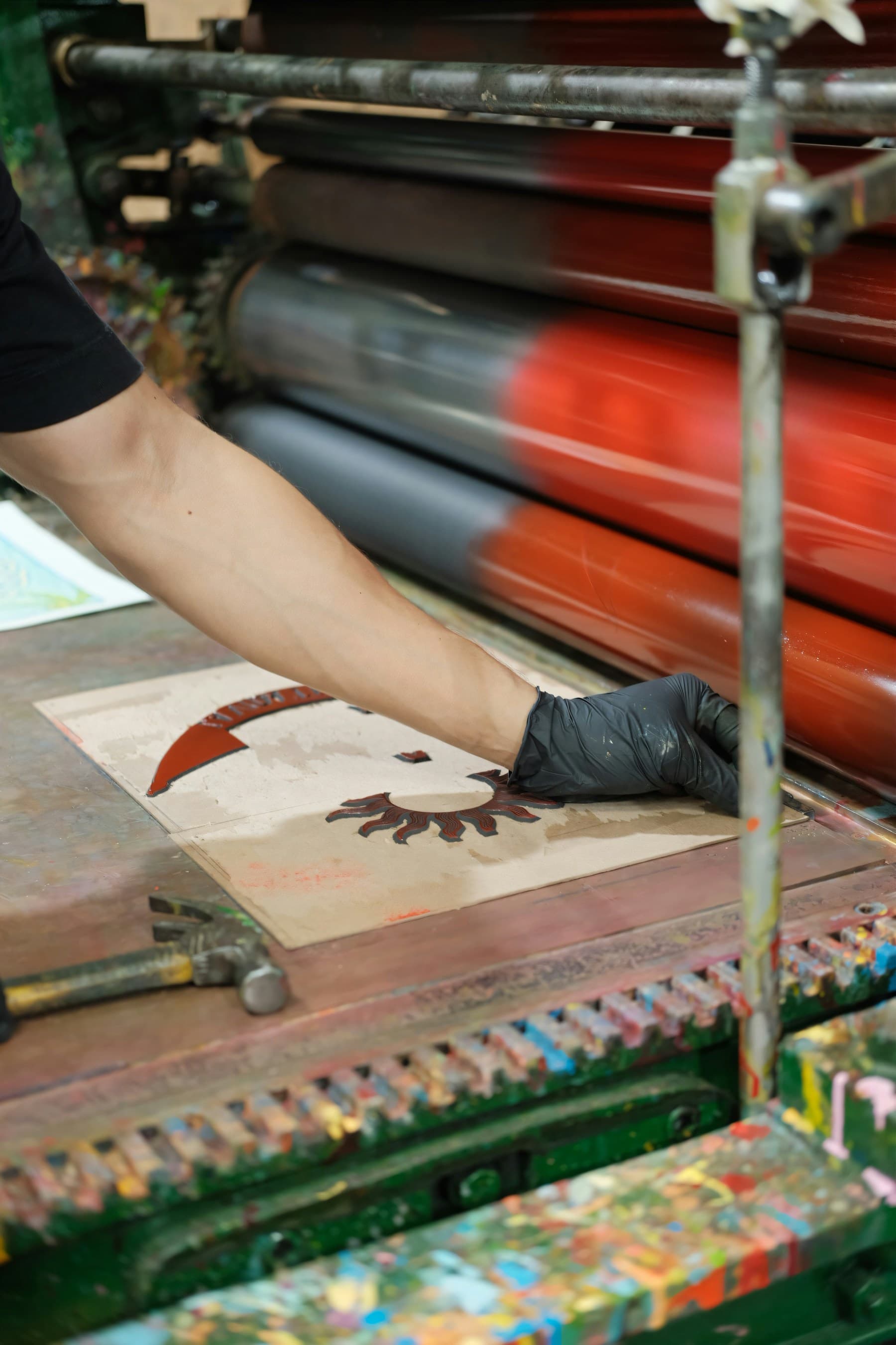
Material / process
Photo by Ernesto Samaniego on Unsplash

Structure / rhythm
Photo by Francesco Albertazzi on Unsplash
06 / Social system
Built to stay recognizable at every size.
The mark leads at small sizes. Campaign language takes over on larger canvases, always using hard alignment and a single acid signal.
Start here / profile picture
Round-safe profile picture kit.
Each option keeps the mark and ring inside the circular crop boundary, with a deliberate outer cushion. Ready for Instagram, LinkedIn, X, WhatsApp, and any other account avatar.


07 / 30-day campaign
A full month without repeating yourself.
A deliberate rotation of brand points of view, practical lessons, studio process, project proof, audience prompts, and one direct invitation—adapted for Instagram, LinkedIn, and X.
Campaign mix
30 days. 3 channels. 90 exports.
10 image-led10 abstract10 typographic90 PNG exports + editable SVGs

Day 01 · Brand
typeMake ideas click.
Good ideas deserve more than a nice surface. We turn them into clear, useful digital work people can act on. This is CURTIIS.
#CURTIIS #BrandStrategy #DigitalBranding #AbujaCreatives #NigerianCreatives
IGLinkedInX
Platform captions
IG
Good ideas deserve more than a nice surface. We turn them into clear, useful digital work people can act on. This is CURTIIS. #CURTIIS #BrandStrategy #DigitalBranding #AbujaCreatives #NigerianCreatives
CURTIIS exists to turn ambitious ideas into digital work that is clear enough to use and distinct enough to remember. Over the next 30 days, we are showing the thinking behind that work. #BrandStrategy #DigitalBranding #CreativeBusiness #NigerianTech
X
Good ideas need clarity, character, and a way forward. We make ideas click. #CURTIIS #BrandStrategy #DigitalBranding

Day 02 · Brand
abstractWhy the Twin Cut?
Two pillars for the double-I in CURTIIS. One rising cut for forward motion. The mark carries the name without spelling it out.
#CURTIIS #BrandStrategy #DigitalBranding #AbujaCreatives #NigerianCreatives
IGX
Platform captions
IG
Two pillars for the double-I in CURTIIS. One rising cut for forward motion. The mark carries the name without spelling it out. #CURTIIS #BrandStrategy #DigitalBranding #AbujaCreatives #NigerianCreatives
The Twin Cut mark starts with the double-I in CURTIIS. Splitting both pillars on a shared angle creates motion, recognition, and a compact signature for small digital spaces. #BrandStrategy #DigitalBranding #CreativeBusiness #NigerianTech
X
Two I’s. One shared cut. A mark built from the name, not added to it. #CURTIIS #BrandStrategy #DigitalBranding

Day 03 · Process
imageGood work starts with good listening.
Before wireframes, we ask what the business needs to change. Listening early saves expensive guessing later.
#CreativeProcess #WebDevelopment #ProductDesign #BehindTheBuild #DigitalStudio
IGLinkedIn
Platform captions
IG
Before wireframes, we ask what the business needs to change. Listening early saves expensive guessing later. #CreativeProcess #WebDevelopment #ProductDesign #BehindTheBuild #DigitalStudio
Our first design tool is a useful conversation. We clarify the audience, the business pressure, and the decision the product must make easier before opening a design file. #CreativeProcess #WebDevelopment #ProductDesign #DigitalStudio
X
Listening early saves expensive guessing later. #CreativeProcess #WebDevelopment #ProductDesign

Day 04 · Education
typeOne screen. One job.
If a screen asks for five decisions at once, none of them feels important. Give each view a clear job and a clear next move.
#WebDesign #UXDesign #DigitalStrategy #WebsiteTips #DesignThinking
IGLinkedInX
Platform captions
IG
If a screen asks for five decisions at once, none of them feels important. Give each view a clear job and a clear next move. #WebDesign #UXDesign #DigitalStrategy #WebsiteTips #DesignThinking
A useful interface gives every screen a primary responsibility. Secondary actions can exist, but hierarchy should make the next decision obvious without explanation. #WebDesign #UXDesign #DigitalStrategy #ProductDesign
X
One screen. One primary job. One obvious next move. #WebDesign #UXDesign #DigitalStrategy

Day 05 · Education
abstractThe 3-second test.
Can a first-time visitor tell what you do, who it is for, and where to go next in three seconds? If not, decoration is not the fix.
#WebDesign #UXDesign #DigitalStrategy #WebsiteTips #DesignThinking
LinkedInX
Platform captions
IG
Can a first-time visitor tell what you do, who it is for, and where to go next in three seconds? If not, decoration is not the fix. #WebDesign #UXDesign #DigitalStrategy #WebsiteTips #DesignThinking
A homepage should answer three questions immediately: What is this? Is it for me? What should I do next? Test those answers before polishing animations or adding more sections. #WebDesign #UXDesign #DigitalStrategy #ProductDesign
X
What is this? Is it for me? What next? Your homepage has about three seconds. #WebDesign #UXDesign #DigitalStrategy

Day 06 · Process
imageFrom rough to useful.
The early version should expose the idea, not hide it under polish. Rough work gives us something honest to test.
#CreativeProcess #WebDevelopment #ProductDesign #BehindTheBuild #DigitalStudio
IGLinkedIn
Platform captions
IG
The early version should expose the idea, not hide it under polish. Rough work gives us something honest to test. #CreativeProcess #WebDevelopment #ProductDesign #BehindTheBuild #DigitalStudio
We keep early concepts deliberately rough. It shifts feedback toward structure, message, and flow before visual polish makes weak decisions feel finished. #CreativeProcess #WebDevelopment #ProductDesign #DigitalStudio
X
Rough work reveals weak ideas before polish protects them. #CreativeProcess #WebDevelopment #ProductDesign

Day 07 · Engagement
typeWhat is slowing your launch?
Too many opinions? Missing content? A feature list that keeps growing? Tell us the real blocker.
#BrandBuilding #CreativeProcess #DesignCommunity #AbujaCreatives #MakeIdeasClick
IGLinkedInX
Platform captions
IG
Too many opinions? Missing content? A feature list that keeps growing? Tell us the real blocker. #BrandBuilding #CreativeProcess #DesignCommunity #AbujaCreatives #MakeIdeasClick
Launch delays rarely come from one dramatic problem. They usually grow from unresolved ownership, unfinished content, or a scope that keeps moving. What is holding your current project back? #BrandBuilding #CreativeLeadership #DesignCommunity #DigitalWork
X
What is slowing your launch: scope, content, decisions, or something else? #BrandBuilding #CreativeProcess #DesignCommunity

Day 08 · Proof
imageMove with less friction.
For MUVN, the design job was simple to say and harder to solve: make movement feel easy before the trip even begins.
#CaseStudy #WebsiteDesign #DigitalTransformation #BrandResults #CreativeBusiness
IGLinkedIn
Platform captions
IG
For MUVN, the design job was simple to say and harder to solve: make movement feel easy before the trip even begins. #CaseStudy #WebsiteDesign #DigitalTransformation #BrandResults #CreativeBusiness
The MUVN product experience reduces uncertainty around movement. Clear task hierarchy and restrained interaction design keep attention on getting from intent to action. #CaseStudy #WebsiteDesign #DigitalTransformation #BusinessGrowth
X
Less uncertainty. Fewer steps. A clearer way to move. Selected work for MUVN. #CaseStudy #WebsiteDesign #DigitalTransformation

Day 09 · Education
abstractStructure before style.
Start with sequence, hierarchy, and decisions. Color cannot rescue a page that does not know what matters.
#WebDesign #UXDesign #DigitalStrategy #WebsiteTips #DesignThinking
LinkedInX
Platform captions
IG
Start with sequence, hierarchy, and decisions. Color cannot rescue a page that does not know what matters. #WebDesign #UXDesign #DigitalStrategy #WebsiteTips #DesignThinking
Strong visual design begins with information order. Set the sequence, hierarchy, and primary decision first; then use typography and color to make that structure visible. #WebDesign #UXDesign #DigitalStrategy #ProductDesign
X
Color cannot rescue a page that does not know what matters. #WebDesign #UXDesign #DigitalStrategy

Day 10 · Education
typeFast is a design decision.
Every heavy image, unnecessary script, and delayed response changes how the brand feels. Speed belongs in the design conversation.
#WebDesign #UXDesign #DigitalStrategy #WebsiteTips #DesignThinking
IGLinkedInX
Platform captions
IG
Every heavy image, unnecessary script, and delayed response changes how the brand feels. Speed belongs in the design conversation. #WebDesign #UXDesign #DigitalStrategy #WebsiteTips #DesignThinking
Performance is not a technical clean-up task. Image choices, animation weight, font loading, and component behavior shape speed long before deployment. #WebDesign #UXDesign #DigitalStrategy #ProductDesign
X
A slow interface feels uncertain. Performance is part of the brand. #WebDesign #UXDesign #DigitalStrategy

Day 11 · Brand
imageBorrow rhythm from the real world.
Repeating planes. Useful tension. Space doing real work. Digital systems get stronger when reference comes from beyond the screen.
#CURTIIS #BrandStrategy #DigitalBranding #AbujaCreatives #NigerianCreatives
IGX
Platform captions
IG
Repeating planes. Useful tension. Space doing real work. Digital systems get stronger when reference comes from beyond the screen. #CURTIIS #BrandStrategy #DigitalBranding #AbujaCreatives #NigerianCreatives
Architecture is a useful reference for interface work: repetition creates rhythm, negative space creates emphasis, and structure carries the experience before decoration arrives. #BrandStrategy #DigitalBranding #CreativeBusiness #NigerianTech
X
Look away from the screen. Rhythm, tension, and hierarchy already exist around us. #CURTIIS #BrandStrategy #DigitalBranding

Day 12 · Education
abstractMobile is the first room.
Do not squeeze the desktop into a smaller frame. Decide what the mobile experience needs first, then let larger screens add space and context.
#WebDesign #UXDesign #DigitalStrategy #WebsiteTips #DesignThinking
IGLinkedIn
Platform captions
IG
Do not squeeze the desktop into a smaller frame. Decide what the mobile experience needs first, then let larger screens add space and context. #WebDesign #UXDesign #DigitalStrategy #WebsiteTips #DesignThinking
Mobile-first design is not a breakpoint exercise. It forces sharper content priority, touch-safe actions, and clearer flows before wider layouts introduce complexity. #WebDesign #UXDesign #DigitalStrategy #ProductDesign
X
Mobile is not the smaller room. For most visitors, it is the front door. #WebDesign #UXDesign #DigitalStrategy

Day 13 · Education
typeYour homepage owes one clear answer.
A homepage does not need to say everything. It needs to make the next right thing unmistakable.
#WebDesign #UXDesign #DigitalStrategy #WebsiteTips #DesignThinking
LinkedInX
Platform captions
IG
A homepage does not need to say everything. It needs to make the next right thing unmistakable. #WebDesign #UXDesign #DigitalStrategy #WebsiteTips #DesignThinking
Treat the homepage as a decision surface, not a storage page. Its job is to orient the right visitor and move them toward the next useful step. #WebDesign #UXDesign #DigitalStrategy #ProductDesign
X
Your homepage does not owe every detail. It owes one clear next step. #WebDesign #UXDesign #DigitalStrategy

Day 14 · Proof
imageCommerce without clutter.
Beauty products need space to speak. For HOZ Beauty, we kept discovery direct and the path to purchase calm.
#CaseStudy #WebsiteDesign #DigitalTransformation #BrandResults #CreativeBusiness
IGLinkedIn
Platform captions
IG
Beauty products need space to speak. For HOZ Beauty, we kept discovery direct and the path to purchase calm. #CaseStudy #WebsiteDesign #DigitalTransformation #BrandResults #CreativeBusiness
HOZ Beauty needed an ecommerce experience where product presentation and purchase clarity supported each other. The result keeps browsing expressive and checkout decisions simple. #CaseStudy #WebsiteDesign #DigitalTransformation #BusinessGrowth
X
Let the product speak. Keep the path to purchase quiet and clear. HOZ Beauty. #CaseStudy #WebsiteDesign #DigitalTransformation

Day 15 · Engagement
abstractWhat can we remove?
One field. One paragraph. One step. What could disappear from your product without hurting the outcome?
#BrandBuilding #CreativeProcess #DesignCommunity #AbujaCreatives #MakeIdeasClick
IGLinkedInX
Platform captions
IG
One field. One paragraph. One step. What could disappear from your product without hurting the outcome? #BrandBuilding #CreativeProcess #DesignCommunity #AbujaCreatives #MakeIdeasClick
A useful mid-project review is subtractive. Which element repeats information, delays the task, or exists because the team is afraid to choose? Remove one and test again. #BrandBuilding #CreativeLeadership #DesignCommunity #DigitalWork
X
What can you remove without hurting the outcome? Start there. #BrandBuilding #CreativeProcess #DesignCommunity

Day 16 · Process
imageThe best feedback is specific.
Not ‘make it pop.’ Tell us what feels unclear, what decision is difficult, or what the audience might miss.
#CreativeProcess #WebDevelopment #ProductDesign #BehindTheBuild #DigitalStudio
IGLinkedIn
Platform captions
IG
Not ‘make it pop.’ Tell us what feels unclear, what decision is difficult, or what the audience might miss. #CreativeProcess #WebDevelopment #ProductDesign #BehindTheBuild #DigitalStudio
Specific feedback shortens design cycles. Describe the user risk or business concern behind the reaction; that gives the team a problem to solve instead of a visual instruction to copy. #CreativeProcess #WebDevelopment #ProductDesign #DigitalStudio
X
Good feedback names the problem, not the pixel change. #CreativeProcess #WebDevelopment #ProductDesign

Day 17 · Process
typeDesign the handoff, too.
A beautiful file is not a finished product. States, logic, content rules, and intent must survive the move into code.
#CreativeProcess #WebDevelopment #ProductDesign #BehindTheBuild #DigitalStudio
LinkedInX
Platform captions
IG
A beautiful file is not a finished product. States, logic, content rules, and intent must survive the move into code. #CreativeProcess #WebDevelopment #ProductDesign #BehindTheBuild #DigitalStudio
Handoff quality is part of design quality. Document component states, responsive behavior, content constraints, and the reason behind unusual decisions—not just measurements. #CreativeProcess #WebDevelopment #ProductDesign #DigitalStudio
X
If the intent gets lost between design and code, the design was not finished. #CreativeProcess #WebDevelopment #ProductDesign

Day 18 · Education
abstractThree states every button needs.
Default. Focus. Disabled. Add hover for pointer devices, but never leave keyboard users guessing where they are.
#WebDesign #UXDesign #DigitalStrategy #WebsiteTips #DesignThinking
IGLinkedIn
Platform captions
IG
Default. Focus. Disabled. Add hover for pointer devices, but never leave keyboard users guessing where they are. #WebDesign #UXDesign #DigitalStrategy #WebsiteTips #DesignThinking
Buttons need visible default, focus, and disabled states. Hover is useful, but it cannot replace focus feedback or explain why an action is unavailable. #WebDesign #UXDesign #DigitalStrategy #ProductDesign
X
Default. Focus. Disabled. Hover is not an accessibility strategy. #WebDesign #UXDesign #DigitalStrategy

Day 19 · Proof
imageMake the network visible.
BizConnect24 turns business discovery into a clearer, more useful path between people, services, and opportunity.
#CaseStudy #WebsiteDesign #DigitalTransformation #BrandResults #CreativeBusiness
IGLinkedIn
Platform captions
IG
BizConnect24 turns business discovery into a clearer, more useful path between people, services, and opportunity. #CaseStudy #WebsiteDesign #DigitalTransformation #BrandResults #CreativeBusiness
For BizConnect24, the product challenge was making a broad business network feel navigable. Strong categorization and task-focused screens help users move from discovery to connection. #CaseStudy #WebsiteDesign #DigitalTransformation #BusinessGrowth
X
A network only works when people can find the right connection. Selected work for BizConnect24. #CaseStudy #WebsiteDesign #DigitalTransformation

Day 20 · Brand
typePretty is not the brief.
The work can look sharp. It still has to explain, guide, sell, reassure, or move something forward.
#CURTIIS #BrandStrategy #DigitalBranding #AbujaCreatives #NigerianCreatives
IGLinkedInX
Platform captions
IG
The work can look sharp. It still has to explain, guide, sell, reassure, or move something forward. #CURTIIS #BrandStrategy #DigitalBranding #AbujaCreatives #NigerianCreatives
Visual quality matters, but appearance is not the outcome. We judge design by what it helps the audience understand and what it helps the business change. #BrandStrategy #DigitalBranding #CreativeBusiness #NigerianTech
X
The work can look sharp. It still has to do a job. #CURTIIS #BrandStrategy #DigitalBranding

Day 21 · Brand
imageTexture earns attention.
A perfect surface is easy to ignore. We use texture where it adds evidence, warmth, or contrast—not as a filter pasted over everything.
#CURTIIS #BrandStrategy #DigitalBranding #AbujaCreatives #NigerianCreatives
IGX
Platform captions
IG
A perfect surface is easy to ignore. We use texture where it adds evidence, warmth, or contrast—not as a filter pasted over everything. #CURTIIS #BrandStrategy #DigitalBranding #AbujaCreatives #NigerianCreatives
Texture is most useful when it signals material, process, or hierarchy. Applied everywhere, it becomes noise; applied with intent, it makes a digital system feel tangible. #BrandStrategy #DigitalBranding #CreativeBusiness #NigerianTech
X
Texture should add evidence, not camouflage weak composition. #CURTIIS #BrandStrategy #DigitalBranding

Day 22 · Brand
abstractThe Twin Cut grid.
The logo is not an island. Its pillars, split angle, and spacing become a grid for layouts, crops, and motion.
#CURTIIS #BrandStrategy #DigitalBranding #AbujaCreatives #NigerianCreatives
IGLinkedIn
Platform captions
IG
The logo is not an island. Its pillars, split angle, and spacing become a grid for layouts, crops, and motion. #CURTIIS #BrandStrategy #DigitalBranding #AbujaCreatives #NigerianCreatives
A useful mark can generate a broader visual system. Twin Cut proportions inform columns, image crops, directional movement, and the placement of campaign language. #BrandStrategy #DigitalBranding #CreativeBusiness #NigerianTech
X
A logo becomes a system when its logic can shape more than the logo. #CURTIIS #BrandStrategy #DigitalBranding

Day 23 · Engagement
typeWould you ship this?
If not, name the exact risk. If yes, name what you are willing to learn after launch. Finished is a decision, not a feeling.
#BrandBuilding #CreativeProcess #DesignCommunity #AbujaCreatives #MakeIdeasClick
IGLinkedInX
Platform captions
IG
If not, name the exact risk. If yes, name what you are willing to learn after launch. Finished is a decision, not a feeling. #BrandBuilding #CreativeProcess #DesignCommunity #AbujaCreatives #MakeIdeasClick
Teams often wait for confidence that only real use can provide. Define the remaining risks, decide which are acceptable, and ship the smallest version that can teach you something true. #BrandBuilding #CreativeLeadership #DesignCommunity #DigitalWork
X
Finished is a decision, not a feeling. Would you ship it? #BrandBuilding #CreativeProcess #DesignCommunity

Day 24 · Proof
imageMake appetite immediate.
For LaPraiz Edibles, the first job is desire. The second is making the order feel effortless.
#CaseStudy #WebsiteDesign #DigitalTransformation #BrandResults #CreativeBusiness
IGLinkedIn
Platform captions
IG
For LaPraiz Edibles, the first job is desire. The second is making the order feel effortless. #CaseStudy #WebsiteDesign #DigitalTransformation #BrandResults #CreativeBusiness
Food commerce needs immediate sensory appeal without hiding practical details. LaPraiz Edibles balances strong product imagery with a direct route to selection and purchase. #CaseStudy #WebsiteDesign #DigitalTransformation #BusinessGrowth
X
Create desire. Remove ordering friction. Selected work for LaPraiz Edibles. #CaseStudy #WebsiteDesign #DigitalTransformation

Day 25 · Education
abstractContrast is part of the message.
If people struggle to read it, the message is weaker. Contrast is not a finishing check; it shapes the palette from the start.
#WebDesign #UXDesign #DigitalStrategy #WebsiteTips #DesignThinking
IGLinkedInX
Platform captions
IG
If people struggle to read it, the message is weaker. Contrast is not a finishing check; it shapes the palette from the start. #WebDesign #UXDesign #DigitalStrategy #WebsiteTips #DesignThinking
Accessible contrast should guide the color system before interface production. Testing early prevents a brand palette from creating recurring usability debt. #WebDesign #UXDesign #DigitalStrategy #ProductDesign
X
If people struggle to read it, the message is weaker. Contrast is content. #WebDesign #UXDesign #DigitalStrategy

Day 26 · Process
typeA launch is a beginning.
Real users will show you what the workshop could not. Watch, measure, fix, and keep the useful parts moving.
#CreativeProcess #WebDevelopment #ProductDesign #BehindTheBuild #DigitalStudio
LinkedInX
Platform captions
IG
Real users will show you what the workshop could not. Watch, measure, fix, and keep the useful parts moving. #CreativeProcess #WebDevelopment #ProductDesign #BehindTheBuild #DigitalStudio
Launch replaces assumptions with evidence. We look at behavior, support questions, performance, and conversion friction to decide what the next iteration should solve. #CreativeProcess #WebDevelopment #ProductDesign #DigitalStudio
X
Launch replaces assumptions with evidence. Watch what happens next. #CreativeProcess #WebDevelopment #ProductDesign

Day 27 · Proof
imageA place needs a pulse online.
A physical place has atmosphere. The website should carry enough of that feeling to make the first visit start before arrival.
#CaseStudy #WebsiteDesign #DigitalTransformation #BrandResults #CreativeBusiness
IGLinkedIn
Platform captions
IG
A physical place has atmosphere. The website should carry enough of that feeling to make the first visit start before arrival. #CaseStudy #WebsiteDesign #DigitalTransformation #BrandResults #CreativeBusiness
For New Wine Place, the digital experience had to communicate atmosphere and practical information together. Strong pacing gives the brand energy without hiding the details visitors need. #CaseStudy #WebsiteDesign #DigitalTransformation #BusinessGrowth
X
The first visit can start before arrival. Selected work for New Wine Place. #CaseStudy #WebsiteDesign #DigitalTransformation

Day 28 · Education
abstract30 pixels can change the feeling.
Spacing changes pace, confidence, and comprehension. Small measurements can carry a large part of the brand feeling.
#WebDesign #UXDesign #DigitalStrategy #WebsiteTips #DesignThinking
IGX
Platform captions
IG
Spacing changes pace, confidence, and comprehension. Small measurements can carry a large part of the brand feeling. #WebDesign #UXDesign #DigitalStrategy #WebsiteTips #DesignThinking
Spacing is not empty. It groups related information, separates decisions, and controls visual pace. A small adjustment can change both comprehension and tone. #WebDesign #UXDesign #DigitalStrategy #ProductDesign
X
Spacing is not empty. It controls pace, hierarchy, and confidence. #WebDesign #UXDesign #DigitalStrategy

Day 29 · Brand
abstractBuilt from tension and balance.
Strong composition is not perfect symmetry. It is knowing where the weight sits and what keeps the whole frame alive.
#CURTIIS #BrandStrategy #DigitalBranding #AbujaCreatives #NigerianCreatives
IGLinkedIn
Platform captions
IG
Strong composition is not perfect symmetry. It is knowing where the weight sits and what keeps the whole frame alive. #CURTIIS #BrandStrategy #DigitalBranding #AbujaCreatives #NigerianCreatives
Balanced composition can still hold tension. Unequal scale, directional lines, and controlled negative space create energy while preserving a clear reading order. #BrandStrategy #DigitalBranding #CreativeBusiness #NigerianTech
X
Balance does not require symmetry. It requires intentional weight. #CURTIIS #BrandStrategy #DigitalBranding

Day 30 · Promotion
typeNext idea. Let’s make it click.
Thirty days of how we think. If you have a website or product that needs more clarity and more character, send us the brief.
#CURTIIS #DigitalAgency #WebDesign #AbujaBusiness #StartUpNigeria
IGLinkedInX
Platform captions
IG
Thirty days of how we think. If you have a website or product that needs more clarity and more character, send us the brief. #CURTIIS #DigitalAgency #WebDesign #AbujaBusiness #StartUpNigeria
We have spent 30 days sharing the principles behind our work. If your next website or digital product needs a clearer direction and a sharper build, talk to CURTIIS. #DigitalAgency #WebDesign #AbujaBusiness #StartUpNigeria
X
Have the idea. Need the clarity and build? Let’s make it click: curtiis.group@gmail.com #CURTIIS #DigitalAgency #WebDesign
08 / Ad flyer campaign
Built to stop the scroll and start the conversation.
Fifty editable 4:5 ad flyers for website and software offers. Cutout-led pieces add human energy; graphic compositions keep the campaign unmistakably CURTIIS.
Ad flyer campaign
50 flyers. Built to be used.
16 cutout-led18 photo-led7 offer-led2160 × 2700 high-res PNG + editable SVG
09 / Business card
A small, physical piece of the system.
The card reads Ese Curtis, Creative Director, and pulls every contact field from the central config.
Single source of truth
Edit name, role, phone, email, address, URL, social handles, copy, palette, and asset labels once in src/config/site.config.ts. The website, this sheet, and every generated SVG update together.
10 / Asset library
Download, edit, deploy.
Every graphic is available as a 2× high-resolution PNG or an editable SVG source. Both versions preserve the CURTIIS type system and come from the same central config.
Identity
Twin Cut mark
SVG · responsive
Identity
Primary lockup
SVG · responsive
Social
Instagram post
1080 × 1080
Social
Instagram story
1080 × 1920
Social
LinkedIn cover
1584 × 396
Social
X cover
1500 × 500
Stationery
Business card · front
3.5 × 2 in · SVG
Stationery
Business card · back
3.5 × 2 in · SVG
Social
Profile picture · Acid field
1080 × 1080 · round-safe
Social
Profile picture · Ink field
1080 × 1080 · round-safe
Social
Profile picture · Canvas field
1080 × 1080 · round-safe
Social
Profile picture · Surface field
1080 × 1080 · round-safe
Social
Highlight · Work
1080 × 1080
Social
Highlight · Services
1080 × 1080
Social
Highlight · Process
1080 × 1080
Social
Highlight · Studio
1080 × 1080
Social
Highlight · Contact
1080 × 1080